
The world of climate dismissives often could be Wonderland, although with multiple Mad Hatters. Both have characters who can believe six impossible things before breakfast. Many wrong climate claims seem more like the Cheshire Cat, who could appear as just a floating grin or a bodiless face to avoid beheading.
Climate claims/myths might be called “Cheshire Claims” here. Like the Cat, they appear anywhere and get repeated without checking, no matter how absurd. As the Cat said, “We’re all mad in here,” an apt description for attempts to disprove the well-established role of fossil fuels in CO2 rise, using misrepresented satellite data.
Many Cheshire Claims are found in Murry Salby’s “CO2 rise is natural”, Skeptical Science (SkS) Myths #188/#189. Each page there summarizes the science and the myth (grin), examines any myth details (face), and then introduces credible, peer-reviewed science to refute the myth.
An unsupported statement by Rupert Darwall led to re-examination of a Salby image that proved to be quite misleading. People with some expertise create claims that others just naively repeat. Darwall seems well-connected with the usual think tanks. On September 24, he will speak at a Heritage Foundation book event on his The Age of Global Warming: A History. Then he heads to Houston for Sept 25/26 conference hosted by Texas Public Policy Foundation.
During the 1990s, Salby wrote a respected text and well-cited papers on atmospheric physics (especially circulation, fluid dynamics, waves, oscillations, ozone) and satellite imaging of clouds. By 2003, his career had waned, citation counts dwindling strongly. In July 2011, Salby suddenly started promoting pseudoscience on carbon-cycle and ice-core records, far outside his research specialties, obvious to anyone who checked. His 2012 revision to his text included at least 13 of the SkS myths. Dismissive blogs took all this seriously.
In 2013, his own actions led to exposure of his long deceptions and NSF debarment and then he misused an eminent associate. Salby’s supporters often attacked mainstream climate scientists for imaginary offenses, but minimized or ignored Salby’s long history of deception, seemingly desperate to retain belief in his claims. People with heart problems might reject cardiologists’ advice when some brain surgeon told them it was all in their heads, even if he had been debarred for deceptive practices. If they lacked knowledge of specialties, anyone called “Dr” might sound good, especially when people often seek miracle cures from outright charlatans with no medical expertise.
Science, briefly, before diving down the rabbit hole for Darwall’s grin
Most CO2 rise since 1750 is caused by humans, especially in Northern Hemisphere, but with a regular “breathing” effect due to plant growth and decay. The Carbon Dioxide Information Analysis Center collects much CO2 data. NOAA‘s Carbon Tracker gives more detailed animations and surface flux data. IPCC WG I AR5 (2013) covers this at various levels of detail, cited later.
 NOAA‘s short animation clearly shows CO2 rise led by Northern Hemisphere mid-latitudes. Each year, the Earth “breathes”, but CO2 ends each year higher than the year before, even as surface temperatures jiggle. All by itself, the image contradicts Salby and Darwall.
Darwall’s unsupported ![]() floating grin
floating grin
London-based Rupert Darwall is a recent addition to the ranks of non-scientists who view climate science through an ideological lens, but get promoted heavily. His book The Age of Global Warming: A History was published in April, blurbed as “a great achievement” by GWPF Chairman Lord Nigel Lawson (see DeSmogUK series) and “a total masterpiece” by James Delingpole. In May he wrote about Lennart Bengtsson for National Review Online in “Science as McCarthyism.” Real historians seldom apply that strong term for simple negative reactions to an old colleague’s descent into repeated foolishness.
With Joanne Nova’s “help” Darwall wrote An Unsettling Climate – Global-warming proponents betray science by shutting down debate. His essay appeared in City Journal, published by the well-funded (#4) Manhattan Institute of Policy Research, a think tank with long history in advocacy for tobacco and against climate science. A detailed dissection will appear in a later post, but here is one of many Cheshire Claims therein.
With no citation or image, Darwall wrote:
“Once again, temperature appears more likely to be the cause, rather than the effect, of observed atmospheric changes. Further, Salby presents satellite observations showing that the highest levels of CO2 are present not over industrialized regions but over relatively uninhabited and nonindustrialized areas, such as the Amazon.”
That not only contradicts massive scientific evidence, but is the sort of short uncited claim that can persist like the Cat’s grin, because it takes great effort for anyone unfamiliar with the background to find this. One has to locate Salby’s videos, look through them and even then, the original source takes more work to locate. This approach to citation bears no resemblance to real scholarship.
Salby’s disconnected face behind Darwall’s grin
As in Alice, the face could disconnect from the body (of real science.) Salby had cherry-picked an old image found amidst papers and newer results that completely contradicted his claims. Salby has published much satellite data analysis, and his 2012 book gets 73 hits for “satellite”, but the image appears neither there, nor in his August 2011 or July 2012 videos.
Finally, Salby’s April 2013 lecture was sponsored at Helmut Schmidt University by EIKE with EE faculty, as the military academy has no climate science group.
As an attendee wrote “Unfortunately, only laymen visited the EIKE-lecture.”
Watch video 39:25-40:30 to see the satellite image and hear his words:
“This is the global distribution of CO2, only recently available from satellites by SIAMACHY. Even these modern observations are limited to continents. But that is where the humans live. Large values in yellow and red are a signature of sources. Notice, they’re not found in the industrialized areas, the Ohio River Valley of the US, or Western Europe or even China. Rather, they appear in the Amazon basin, tropical Africa, Southeast Asia. Those regions have little human population, let alone industrialization. What I really want you to notice is that even in those source regions, CO2 deviates from its global mean by less than 5%.”
Salby’s version at right can be found at
The HockeySchtick or WUWT (Monckton).
Its labels are not very helpful in locating the real source and description:
Satellite Observations
CO2 (ppmv)
(SCIAMACHY) That is at least a clue.
The original has the same map, but different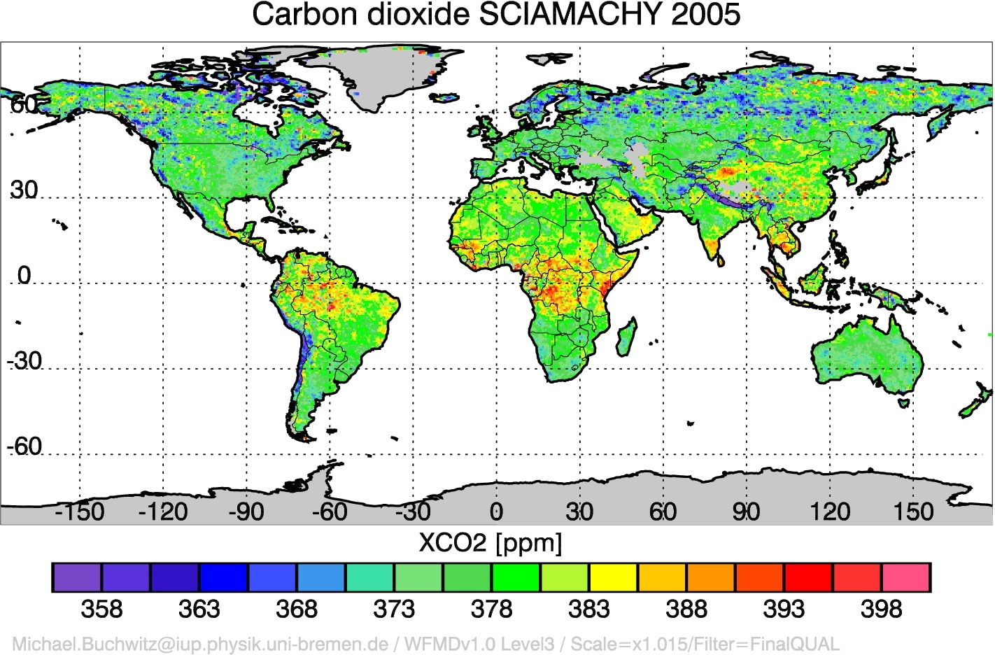
Carbon dioxide SCIAMACHY 2005
XCO2 (ppm) and at bottom:
Email address /software versions
This covers just one year and the email contact allows easy verification.
These images seem convincing. Are they? Another fantasy’s words fit better:
“I don’t think it means what you think it means.”
Real Science, CO2 rise is human, cat’s face has no real body
Lars Karlsson quoted a 2011 SCIAMACHY paper to refute Salby’s claims here, here. Tom Curtis also mentioned it, but in 2013 the original image still seemed not to be found.
A recent email to a few of those authors got a quick response from Michael Buchwitz, who quickly recognized the original source image above and kindly provided explanations and links to papers and website. The Image Gallery page lists 2003-2204 images near bottom, and newer “Carbon Dioxide (CO2): Various images” here:
“The global maps show the distribution of CO2 obtained when averaging all observations obtained for several years (here: 2006-2011).” (Click image to enlarge).


The image above is smoothed, but the same webpage offers more detailed regional images of high-emission areas, such as the ones Salby claimed had low emissions: Eastern USA (Ohio River Valley), Western Europe, or at right, China. Click image to enlarge.
These images make sense, but why are they so different?
The 2005 image was really early raw data from one year. It needed much further processing and algorithm improvement to convert to realistic images, and the algorithms work better with more years of data. It was generated in 2008, its limitations documented then, followed by papers with improvements, years before Salby’s first use in 2013. Researchers noted issues of clouds that lower the NH values, aerosols, dust storms, mountains and other confounders. Slash-and-burn agriculture and forest fires also matter. The raw data measures an entire air column from ground to space.
It does not directly give ground-level sources, which need an “inverse” to be computed using atmospheric circulation models. Winds matter.
Had Darwall given the original image, or a good reference, it would have been trivially checkable. Then, it took some effort to find Salby’s image, and even that was not very helpful, as SCIAMACHY has a large website.
Karlsson’s clue was much more direct and helped find the relevant authors.
The SCIAMACHY work is consistent with the IPCC and related research papers, not with Salby’s Cheshire claim, nonsense that Darwall did not check, either because he did not try or because he lacked relevant expertise.
There was a grin, and a face, but they were illusions. There was no cat.
Backup detail, for those who want to learn more, a good illustration of hard work needed to turn raw satellite data into useful information.
SCIAMACHY provides an online book describing its work and the challenges of acquiring, processing and properly interpreting satellite data, not straightforward. Many papers were published, even well before 2013:
Buchwitz, M., Schneising, O., Reuter, M., Bovensmann, H., Burrows, J.P., Greenhouse gases from SCIAMACHY/ENVISAT nadir observations: CO2 and CH4 during 2003-2005, Proceedings 2008 EUMETSAT Meteorological Satellite Conference, Darmstadt, Germany, 8-12 September 2008.
p.2 “It is well known from highly accurate and precise CO2 surface observations that CO2 is currently rising by on average about 2 ppm/year (0.5%/year) mainly due to the burning of fossil fuels (IPCC, 2007).”
p.3-4 “As can be seen from a comparison of the top left panel with the top right panel, a large difference exists between the (true) CarbonTracker yearly average (top left) and the average obtained by sampling the output of CarbonTracker only if SCIAMACHY data are available. This is due to the relatively sparse sampling of the SCIAMACHY data because of cloud cover, too low sun elevation,etc. … As can also be seen, the SCIAMACHY XCO2 is significantly more variable compared to CarbonTracker. For a detailed discussion of this we refer to Schneising et al., 2008a.”
p.6 “For methane a data quality has been reached which permits inverse modeling of regional methane surface fluxes … For CO2 especially errors due to clouds and aerosols need to be further reduced (Schneising et al., 2008a)….”
(Essentially, they are saying: do not over-interpret the CO2 images at that time.)
2011: O. Schneising, M. Buchwitz, M. Reuter, J. Heymann, H. Bovensmann, and J. P. Burrows, Long-term analysis of carbon dioxide and methane column-averaged mole fractions retrieved from SCIAMACHY, Atmos. Chem. Phys., 11, 2863-2880,
Lars Karlsson and Tom Curtis quoted from this one.
IPCC WG I AR5 (2013) covers this with increasining detail in the SPM (B.5, pp.11-12), TS (TS.2.8, pp.50-52, TS.3.2, pp.53-56), and main report, Chapter 6 (especially 6.3.2, pp.488-). For some reason, Darwall seems to think the IPCC does not understand this topic.
p.492 “… substantial evidence, for example, from 13C carbon isotopes in atmospheric CO2 (Keeling et al., 2005) that source/sink processes on land generate most of the interannual variability in the atmospheric CO2 growth rate (Figure 6.12). …With a very high confidence, the increase in CO2 emissions from fossil fuel burning and those arising from land use change are the dominant cause of the observed increase in atmospheric CO2 concentration.”
p.494 “Most of the fossil fuel CO2 emissions take place in the industrialized countries north of the equator.
p.501 “The interannual variability of the residual land sink shown in Figures 6.12 and 6.16 accounts for most of the interannual variability of the atmospheric CO2 growth rate …A combined El Niño-Southern Oscillation (ENSO)–Volcanic index time series explains 75% of the observed variability (Raupach et al., 2008). A positive phase of ENSO (El Niño, see Glossary) is generally associated with enhanced land CO2 source, and a negative phase (La Niña) with enhanced land CO2 sink (Jones and Cox, 2001; Peylin et al., 2005).”UPDATE: 03/18/15: fix link to City Journal.
Image Credits: Netali / Shutterstock