

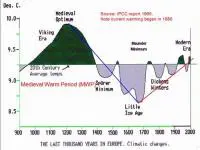
This contest was clearly too easy. As the first respondent pointed out, I telegraphed the answer by calling the author of this graph, Dr. Timothy F. Ball, a “distinguished” Canadian climatologist. it seems that sarcasm CAN translate to the printed page once in a while.
The graph, complete with a trend line from the top of one peak to the bottom of the next valley, was taken from a lecture that Ball gave to the Winnipeg-based Frontier Centre for Public Policy, which can be found here.
Regardless of the “credit etched on the graph,” I have not been able to find anything quite like it in the 1995 IPCC report.
So, if Steve Bloom and Geoff would like to send us their size and address, we’ll pop a couple of DeSmog t-shirts in the mail.