There remains a lot of messaging and spin running rampant online over Washington Post colmunist George Will’s misguided and baseless claims that sea ice coverage is similar to 1979.
DeSmog writer Mitchell Anderson has been covering this baffling story for us and doing a great job, but I wanted to provide a few of the sources that have done a particularly good job at highlighting just how much sea ice we have lost since the 1970’s when we first started recording such things.
These source easily and compellingly explain away George Will’s incorrect claim that sea ice coverage is the same today as it was in 1979.
1. You can watch the extent of Arctic Ice melt decreasing over time. Here’s a great satellite image time series video done by NASA that shows the year-to-year melting of sea ice in the Arctic. I don’t know how anyone could argue that sea ice in the Arctic is the same as it was in 1979 after watching this video:
2. Old ice versus new ice. It’s a simple argument used by people looking for any reason to deny the realities of climate change to talk about sea ice “extent” as opposed to sea ice mass. According to the National Snow and Ice Data Center, the issue is not as much the change in the “extent” but the change in the thickness of the ice over time – there’s a lot more thin ice that quickly melts in the Spring as opposed to older thick ice:
So the extent of the ice – the actual surface area of the ice covering the Arctic sea – may appear large from time to time, but the amount of thick, old ice has been going down since the 1970’s when scientists first began monitoring such things.
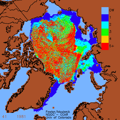
Here’s a great time series of the decrease in old ice in the Arctic. The colors indicate the age of the sea ice in years; light blue is open water (OW). Areas in red are locations where the ice is five years or older, whereas the dark blue areas are first-year ice.
So all the dark blue areas are first year ice and the bright red is 5 years or older:
3. If you still think Arctic Sea Ice is the same as it was in 1979, then here’s a satellite image of the Arctic sea taken in August, 2007. The purple line is where the sea ice usually was between 1979 and 2000.

This image and the animated one above were produced by the National Snow and Ice Data Center (NSIDC) in Boulder, Colorado. In fact, the NSIDC has just today released a new report finding:
800,000 square kilometers is a lot of ice to go missing and with all this data so easily obtained (took me about an hour), you would think it would pretty difficult for a news outlet like the Washington Post and a seasoned journalist like George Will to ignore.
This month we’re giving away FREE copies Keith Farnish’s new book Times Up: an uncivilzed solution to a global crisis.
Go here to find out more details about DeSmogBlog’s monthly book give-away.